Overview
Urbantide is a streetwear label built for a generation that, in the brand's own words, refuses to blend in. The identity translates that into a torn brush logotype, a colourway system that can shout or stay black, and apparel graphics designed to read across a crowded street.
Deliverables
What was produced
- 01
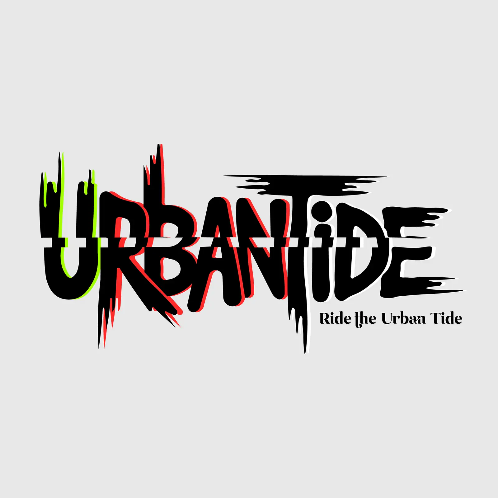
Brush-script logotype with a 'Ride the Urban Tide' descriptor lock-up.
- 02
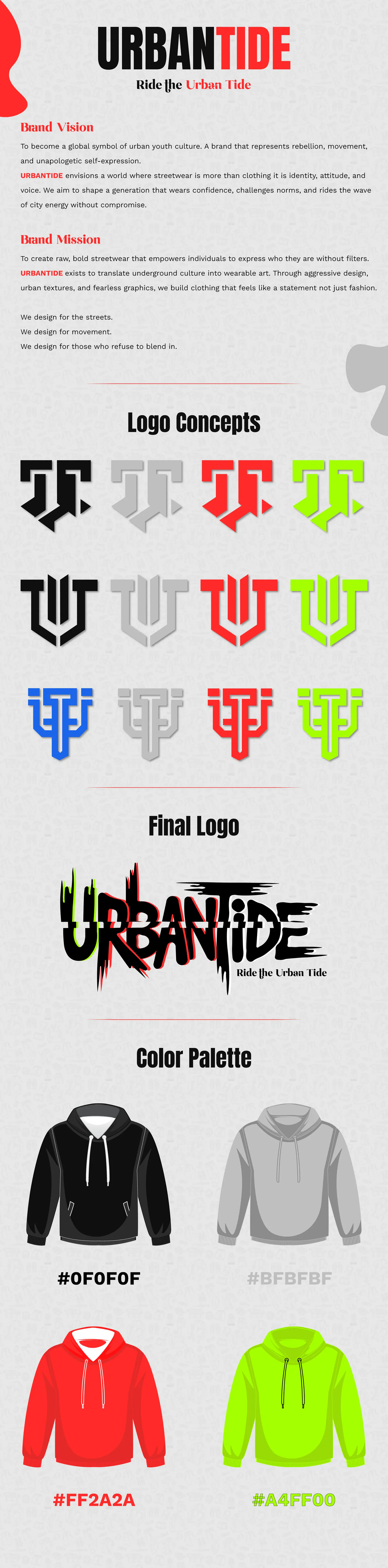
Four-way colourway system – black, greyscale, red and acid green – for the monogram mark.
- 03
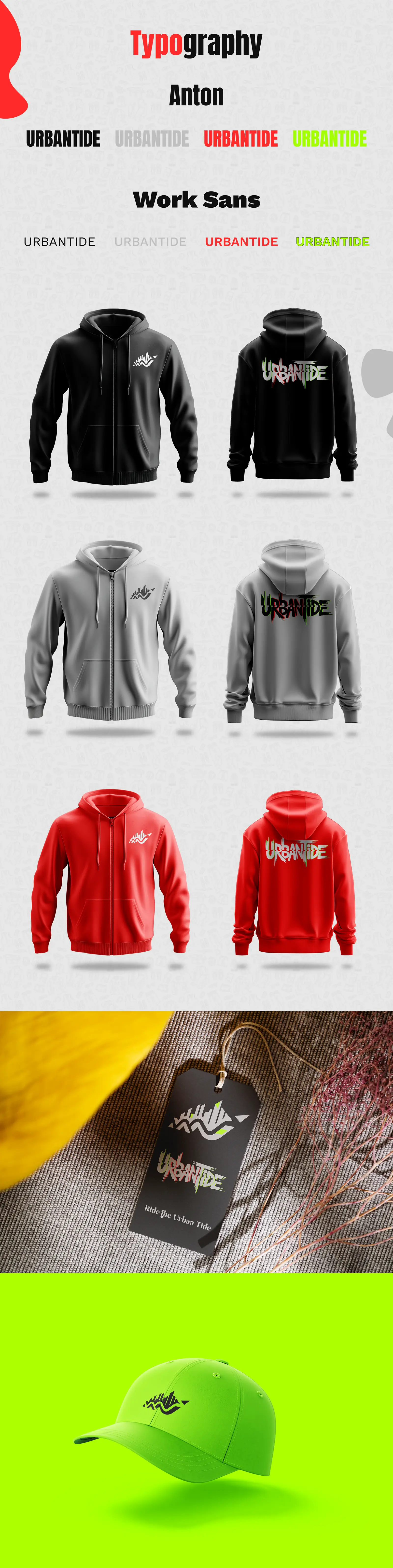
Typography system pairing Anton for display with Work Sans for supporting copy.
- 04
Brand vision and mission statements written into the brand book.
- 05
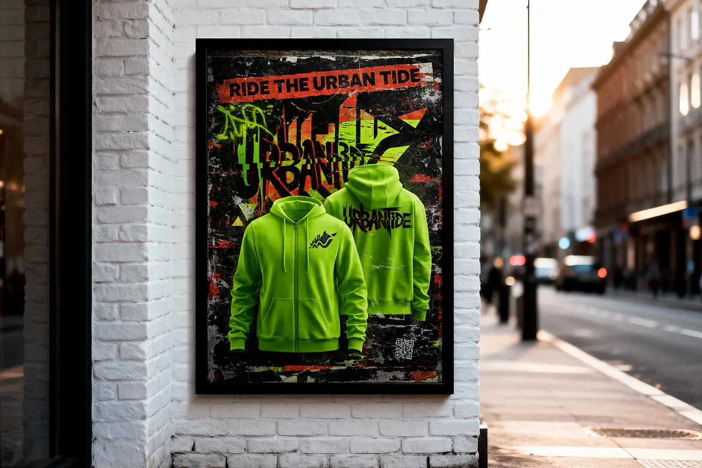
Hoodie graphics in black and neon, plus a street-poster campaign mockup.
Approach
How it was designed
- 01
The logotype is drawn with dripping, torn edges so it reads as applied by hand rather than set on a computer – closer to a tag than a trademark.
- 02
Acid green against black is reserved for drops and campaign moments; the everyday brand runs monochrome, which keeps the neon rare enough to stay loud.
- 03
Anton's condensed weight lets long words hold a hoodie chest or a poster headline without breaking across lines.
- 04
The monogram is built as a standalone mark so it can be embroidered small on a sleeve while the full logotype carries the front.