Overview
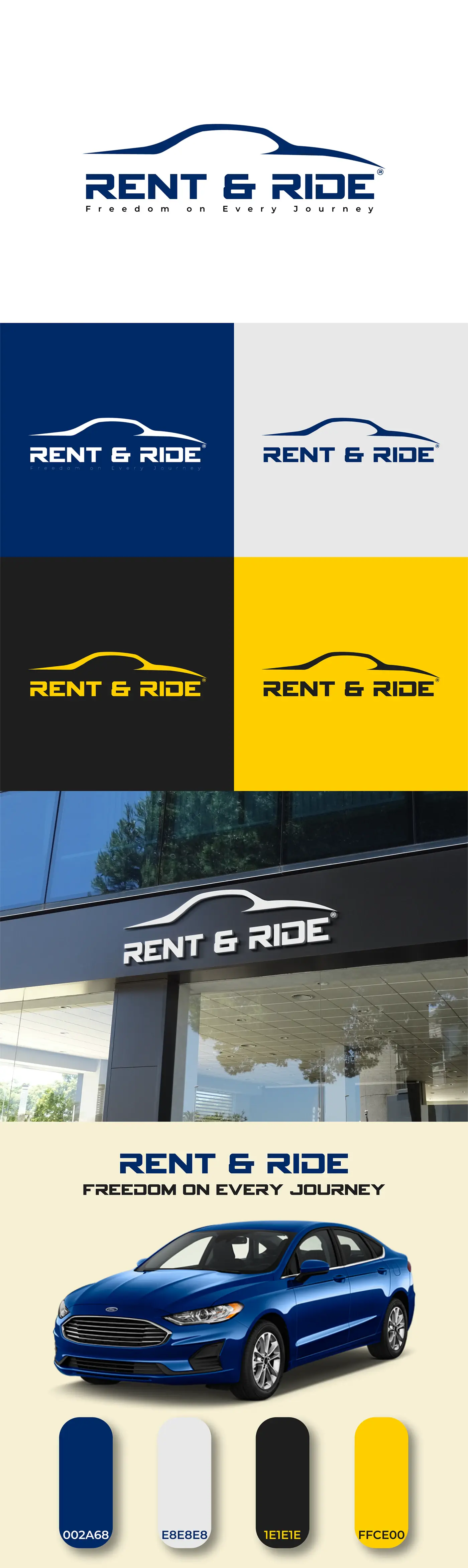
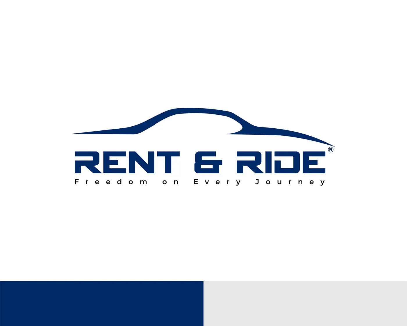
Rent & Ride is a car rental brand whose promise – 'Freedom on Every Journey' – needed a mark that suggested movement without resorting to speed lines. The answer was a single unbroken stroke that reads as a car profile from a distance and as a horizon up close.
Deliverables
What was produced
- 01
Primary logo pairing a one-stroke car silhouette with a wide, engineered wordmark.
- 02
Colourway system across navy, white, black and signal yellow.
- 03
Brand board documenting lock-ups, clear space and application examples.
Approach
How it was designed
- 01
Drawing the car as one continuous line keeps the mark legible on a key fob and on a forecourt sign alike.
- 02
Navy and yellow split the difference between trustworthy and energetic – reassuring for the rental contract, lively for the journey.
- 03
The wordmark is widely tracked and set in caps so 'RENT & RIDE' stays balanced under the curve of the mark.
- 04
Each colourway is fixed to a specific use so branch signage, documents and digital never drift apart.