Overview
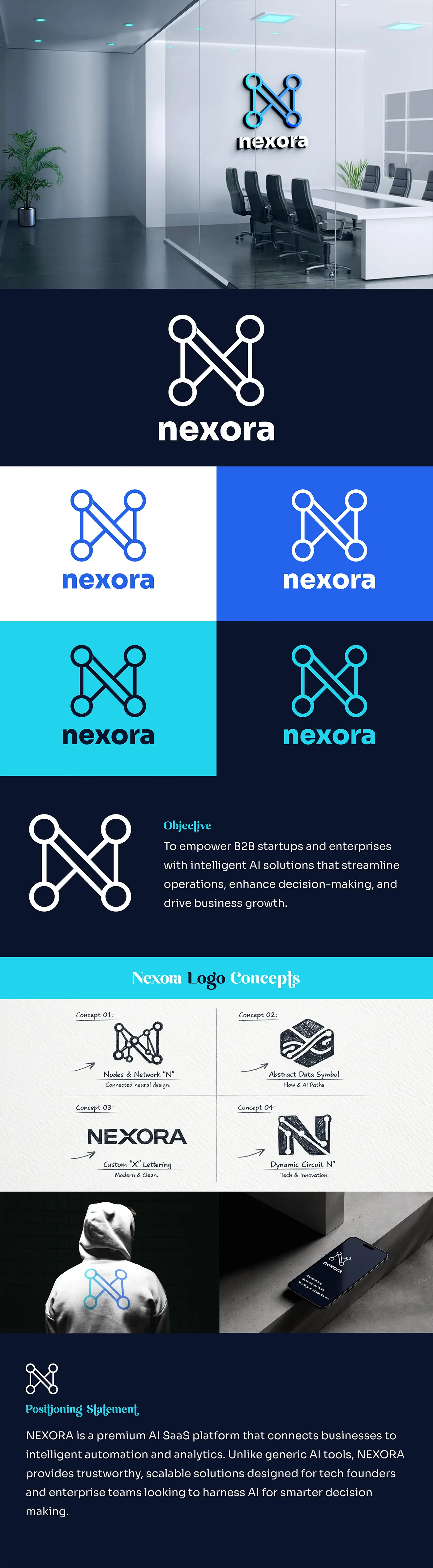
Nexora needed an identity that would read as a technology company without the usual swooshes and circuit boards. The monogram is built from four connected nodes that form an 'N' – a network diagram and a letter at the same time.
Deliverables
What was produced
- 01
Node-based 'N' monogram with a lowercase wordmark lock-up.
- 02
Positive and reversed colourways for light, dark and brand-blue grounds.
- 03
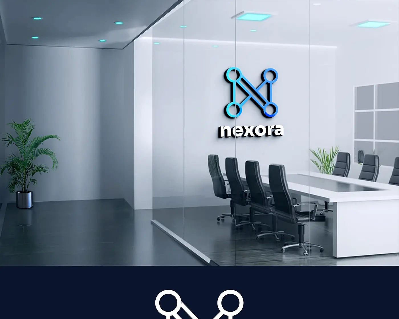
Brand board with signage and interior application mockups.
Approach
How it was designed
- 01
The mark is drawn on a strict geometric grid so the connecting strokes stay even when the logo is cut for illuminated signage.
- 02
Nodes are left as open circles rather than filled dots, which keeps the monogram light at small sizes.
- 03
A single brand blue with a cool grey support keeps the identity calm enough for a document header and bold enough for a reception wall.
- 04
The wordmark is set lowercase to soften a geometric mark that could otherwise read as cold.