Overview
Futures Consulting advises businesses on growth, and its identity needed to hold up in the two places a consultancy is judged: across a table and on a building. The mark was designed at both extremes at once.
Deliverables
What was produced
- 01
Primary logo pairing an abstract figure mark with a two-tone wordmark.
- 02
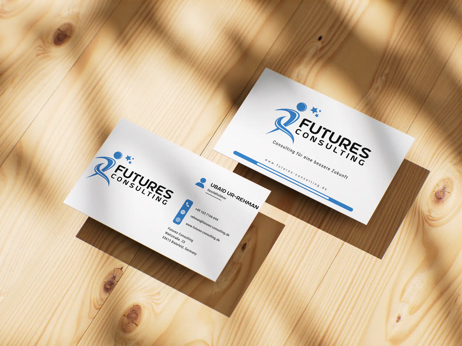
Double-sided business card with a full-bleed logo face and a clean contact face.
- 03
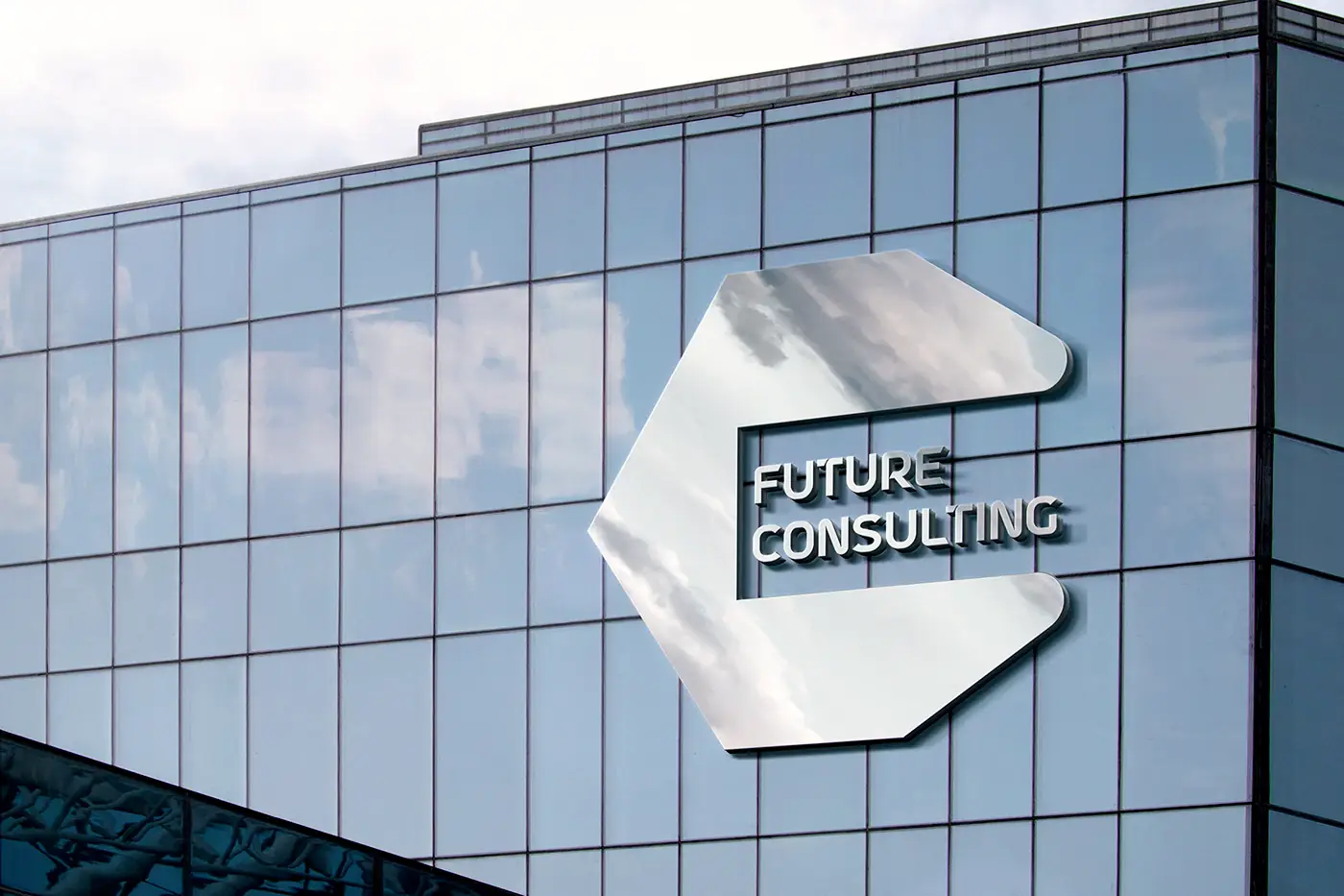
Building signage application as a dimensional mounted mark.
- 04
Presentation mockups for both applications.
Approach
How it was designed
- 01
An abstract human figure in motion keeps the mark about people rather than charts, which is what a consultancy actually sells.
- 02
Two blues – one deep, one bright – separate 'Futures' from 'Consulting' in the wordmark without needing a second typeface.
- 03
The mark holds a minimum size of a few millimetres on a card, so the same artwork can be cut for a façade without redrawing.
- 04
The card's reverse is kept almost empty, giving the contact details room and the brand a moment of confidence.