Overview
Greenly makes farm-fresh organic products for families, and wanted a brand that felt joyful rather than worthy – the usual trap in the organic category. The work runs from positioning through to a complete brand book: vision, mission, values, three logo routes and the applications that follow from them.
Deliverables
What was produced
- 01
Brand vision, mission and values – freshness, sustainability, trust, simplicity, care.
- 02
Three logo concept routes, from a soft lowercase wordmark to a badge lock-up.
- 03
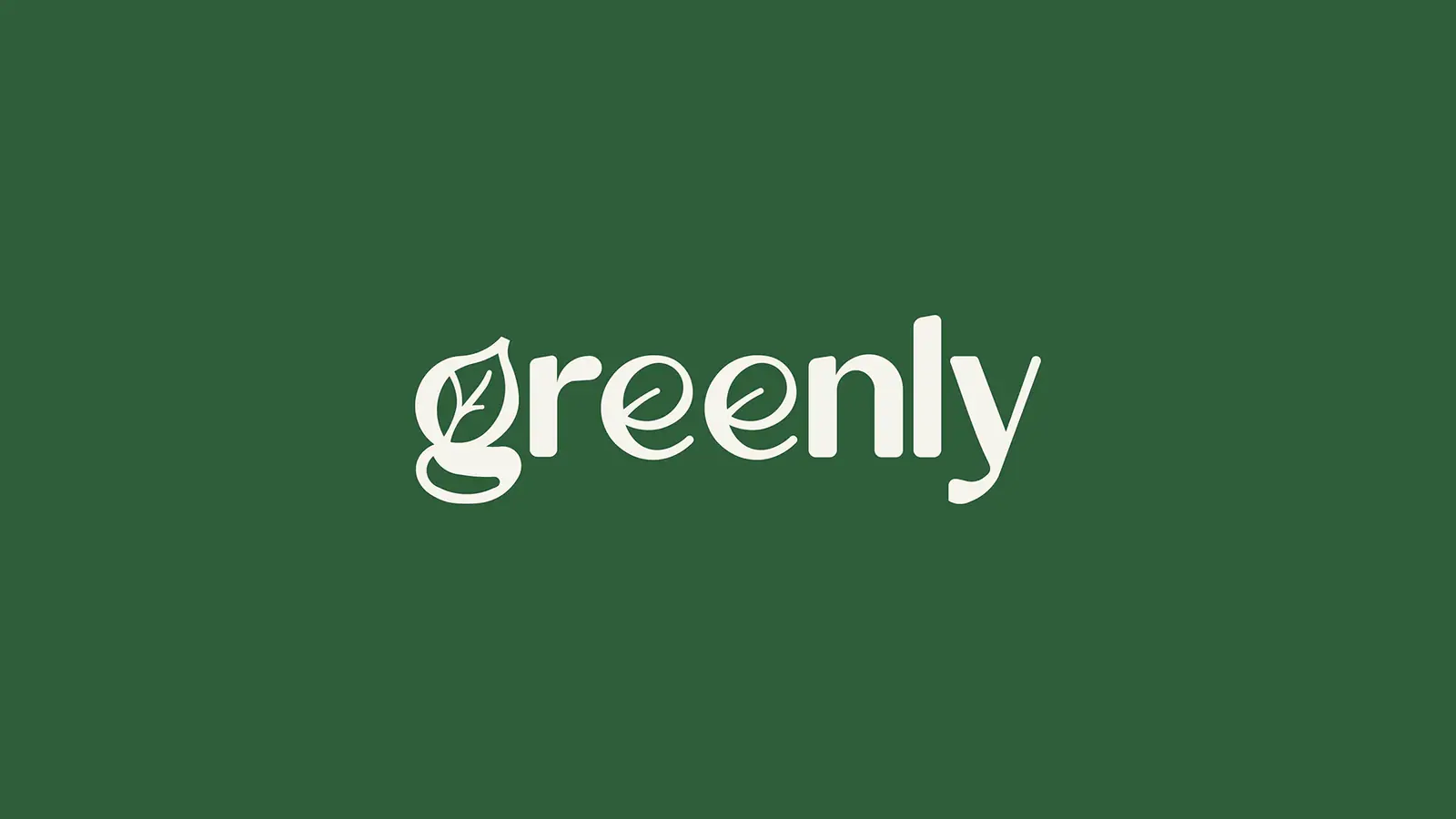
Final leaf-and-wordmark identity with reversed and single-colour versions.
- 04
Colour palette, typography and pattern system.
- 05
A complete brand book covering packaging, signage and social applications.
Approach
How it was designed
- 01
A rounded lowercase wordmark with a leaf terminal keeps the brand friendly, steering away from the clinical greens that dominate the category.
- 02
Deep forest green does the heavy lifting so the brighter accent greens stay available for product ranges.
- 03
A repeating botanical pattern gives packaging and social posts a shared texture without needing new photography each time.
- 04
Three concepts were developed in full rather than as sketches, so the client chose between finished routes instead of guessing from thumbnails.