
Overview
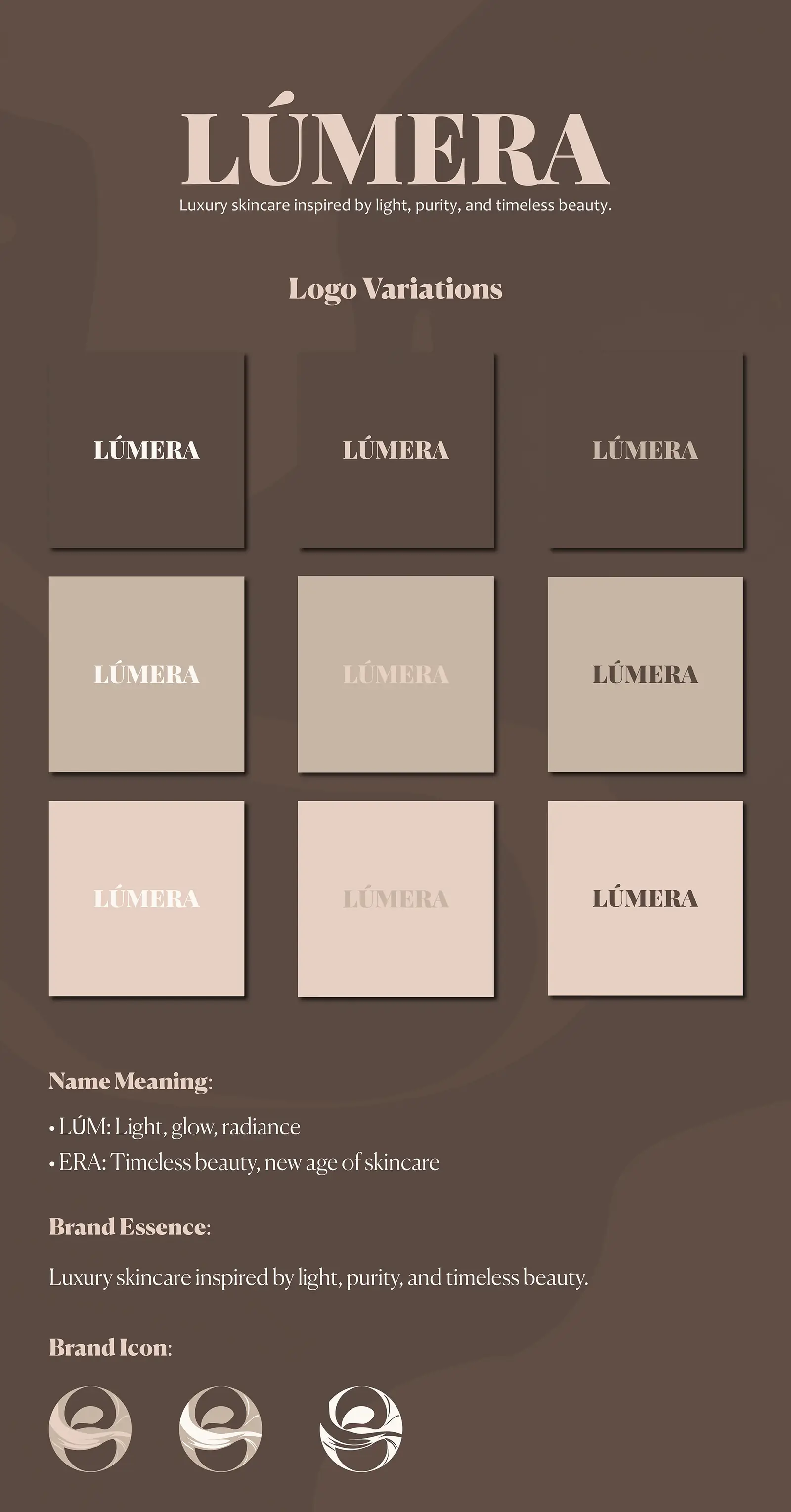
Lúmera is a premium skincare label whose name joins 'lum' – light, glow, radiance – with 'era' – a new age of timeless beauty. The identity was built to carry that meaning without saying it: a quiet wordmark, a palette drawn from skin and stone, and a logo system that survives being embossed, foiled or printed at thumbnail size.
Deliverables
What was produced
- 01
Primary wordmark with nine approved lock-up variations across light, mid and dark grounds.
- 02
Brand icon set exploring the 'light' motif as a simple circular mark.
- 03
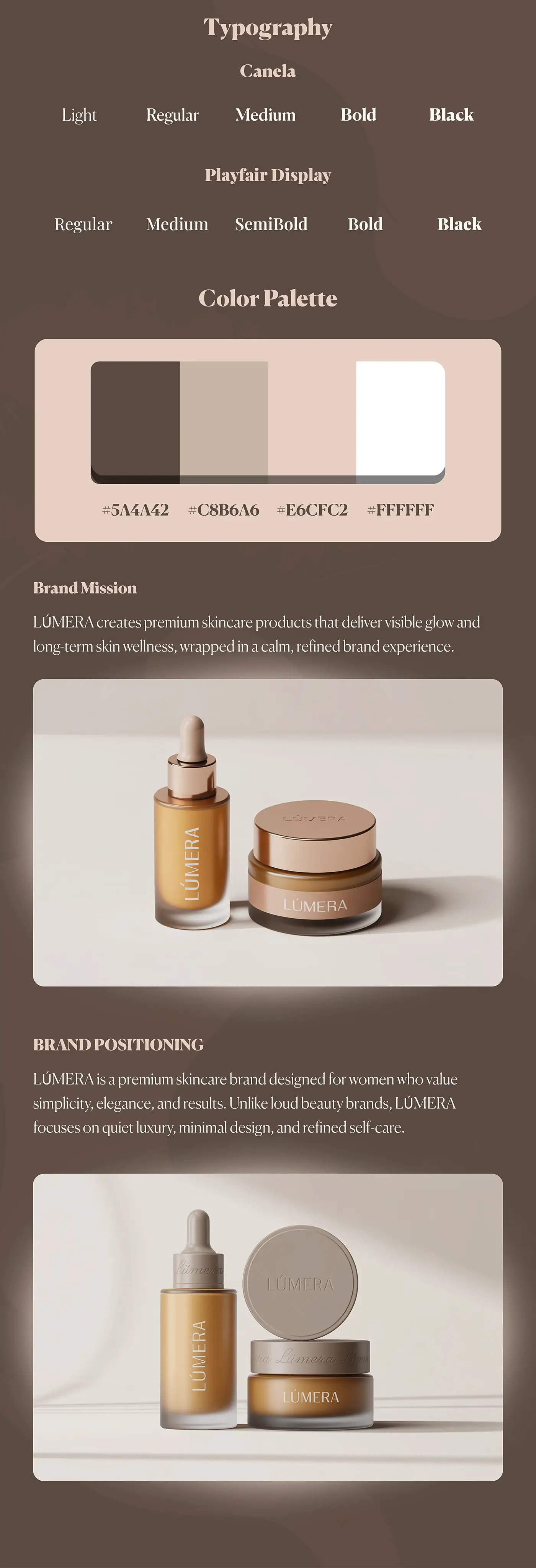
Typography system pairing Canela with Playfair Display across five weights.
- 04
Four-colour palette – #5A4A42, #C8B6A6, #E6CFC2 and white – with usage guidance.
- 05
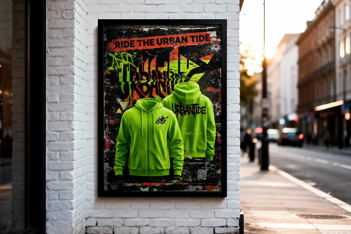
Campaign poster and framed presentation mockup.
Approach
How it was designed
- 01
The wordmark is set in a high-contrast serif with wide tracking, so the name reads as composed rather than decorative.
- 02
The palette is deliberately narrow – three warm neutrals and white – which is what makes the range feel expensive across packaging and print.
- 03
The brand icon reduces to a single circular glyph that still works at favicon size, giving the label a mark as well as a name.
- 04
Logo variations are drawn for each background tone up front, so the brand never needs an improvised version in production.