Overview
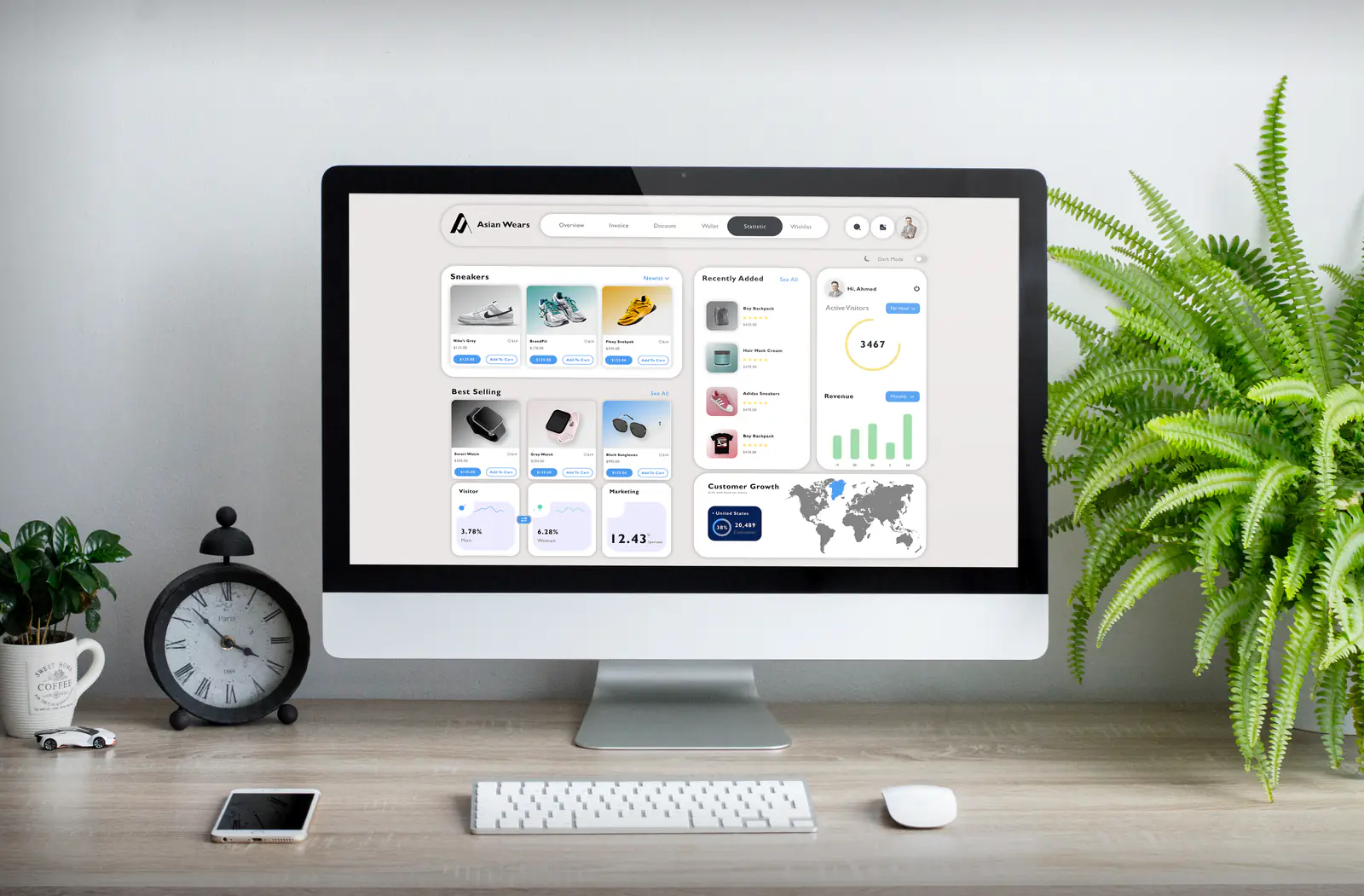
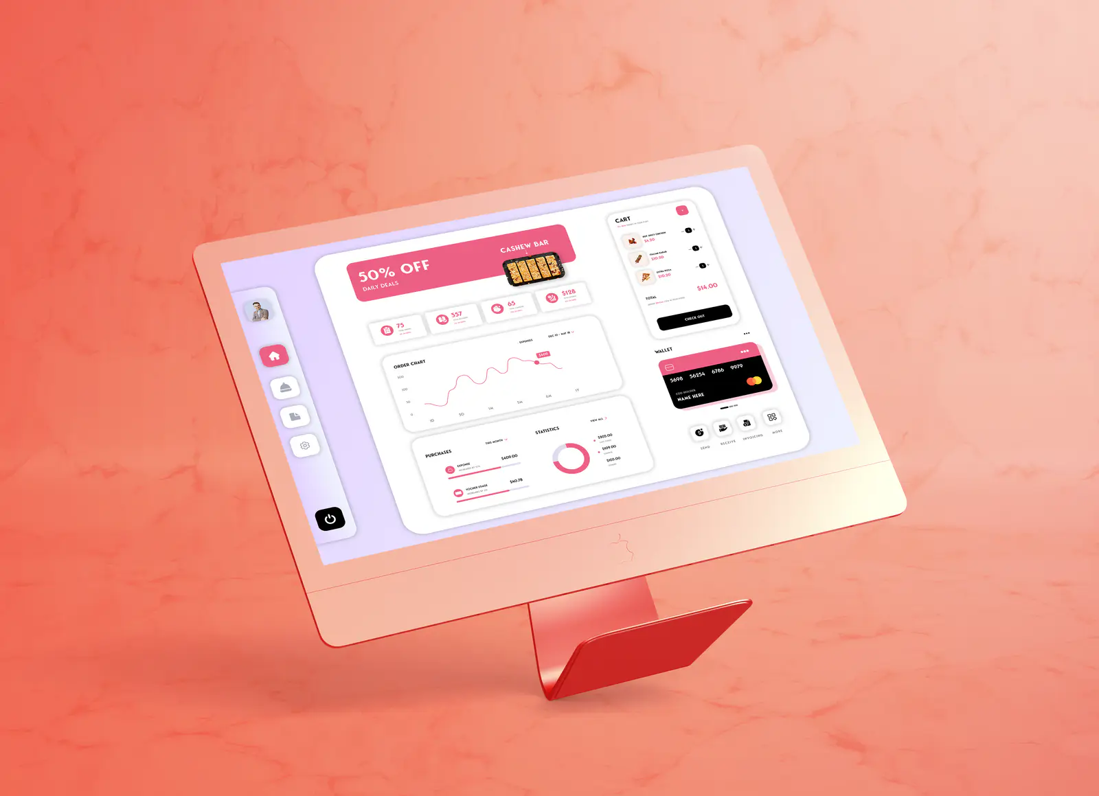
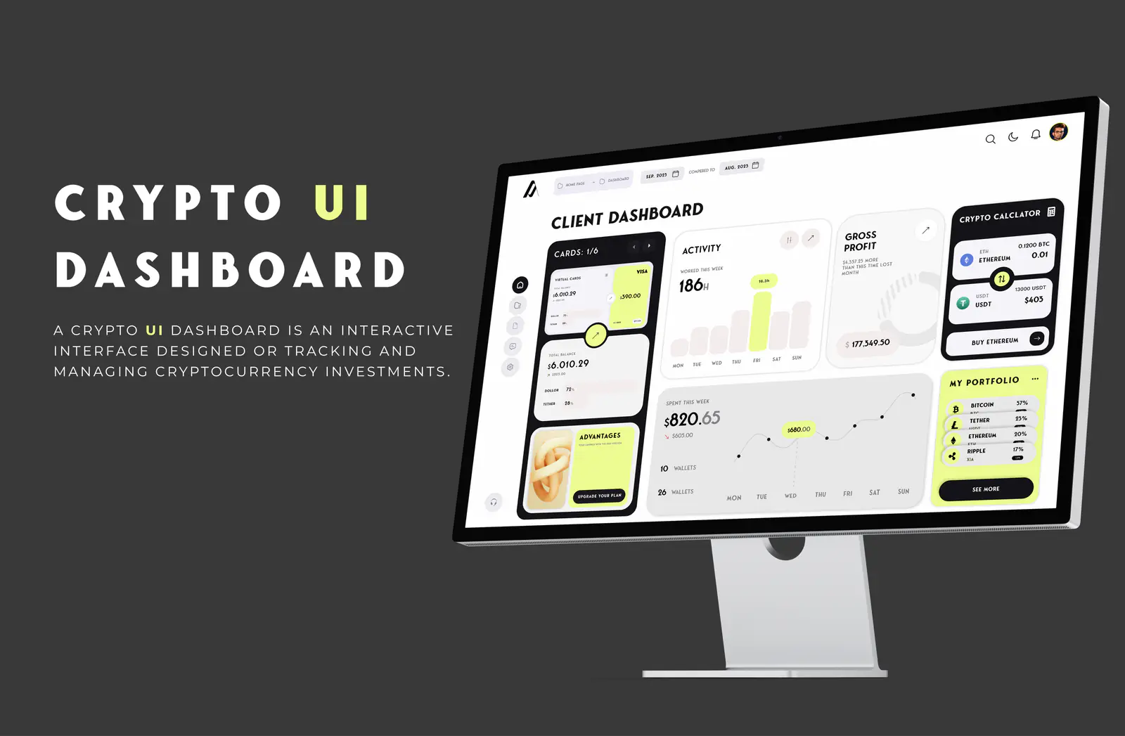
Three self-initiated interface studies, each solving the same underlying problem for a different audience: how much information can a single screen carry before it stops being useful. The crypto dashboard tracks a live portfolio, the commerce dashboard manages a product catalogue, and the retail board summarises sales performance.
Deliverables
What was produced
- 01
Crypto portfolio dashboard with a client overview, activity chart, gross-profit card and holdings list.
- 02
E-commerce admin dashboard covering inventory, recent orders and regional performance.
- 03
Retail analytics dashboard laid out for tablet, leading with promotions and revenue trend.
- 04
Device presentation renders for each study.
Approach
How it was designed
- 01
Each dashboard picks one accent colour and spends it only on the metric that matters most, so the eye lands in the right place first.
- 02
Cards share a single corner radius, padding scale and label style, which lets very different data types sit on one screen calmly.
- 03
Numbers are set large and unitalicised with their labels beneath, so a value can be read before its context.
- 04
The crypto board runs dark to suit prolonged monitoring; the commerce and retail boards run light for daily operational use.