Overview
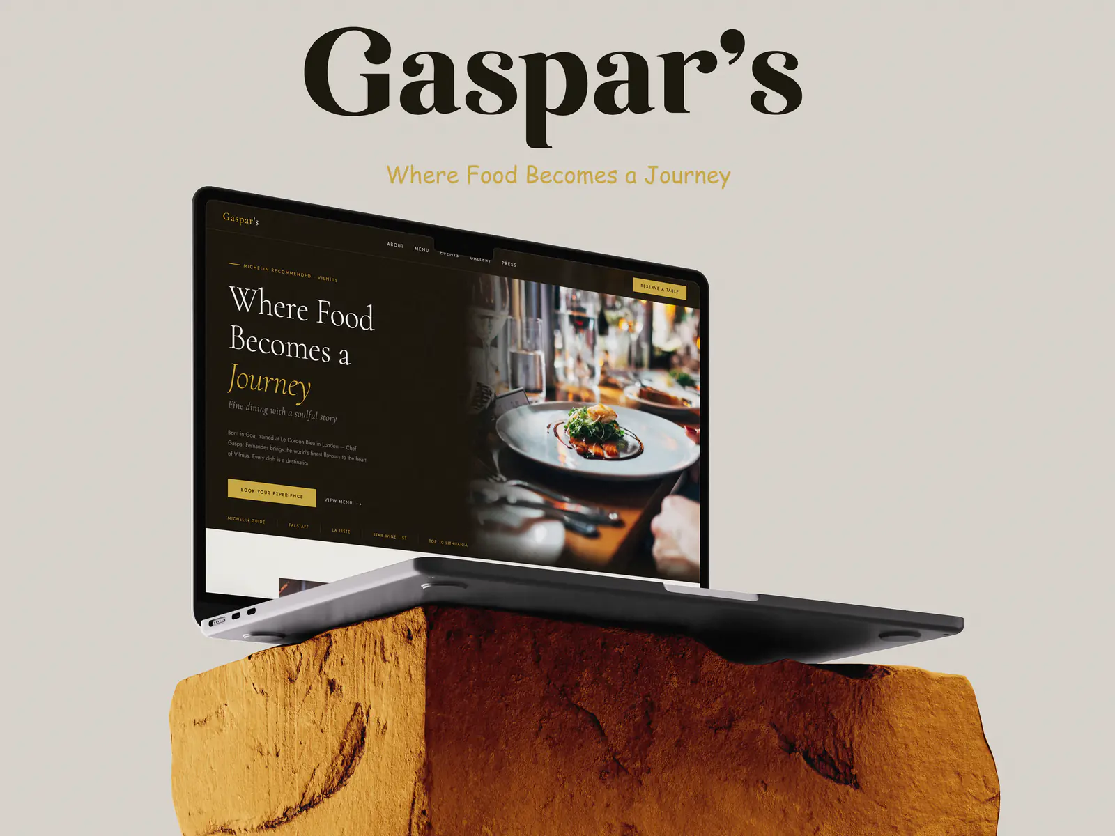
Gaspar's is a fine-dining restaurant whose tagline – 'Where Food Becomes a Journey' – set the tone for the whole design. The site is built as a slow, editorial read rather than a menu dump: each screen gives one idea room to breathe, with photography doing the selling and type carrying the restaurant's character.
Deliverables
What was produced
- 01
Homepage concept with a full-bleed hero and the restaurant's tagline as the opening statement.
- 02
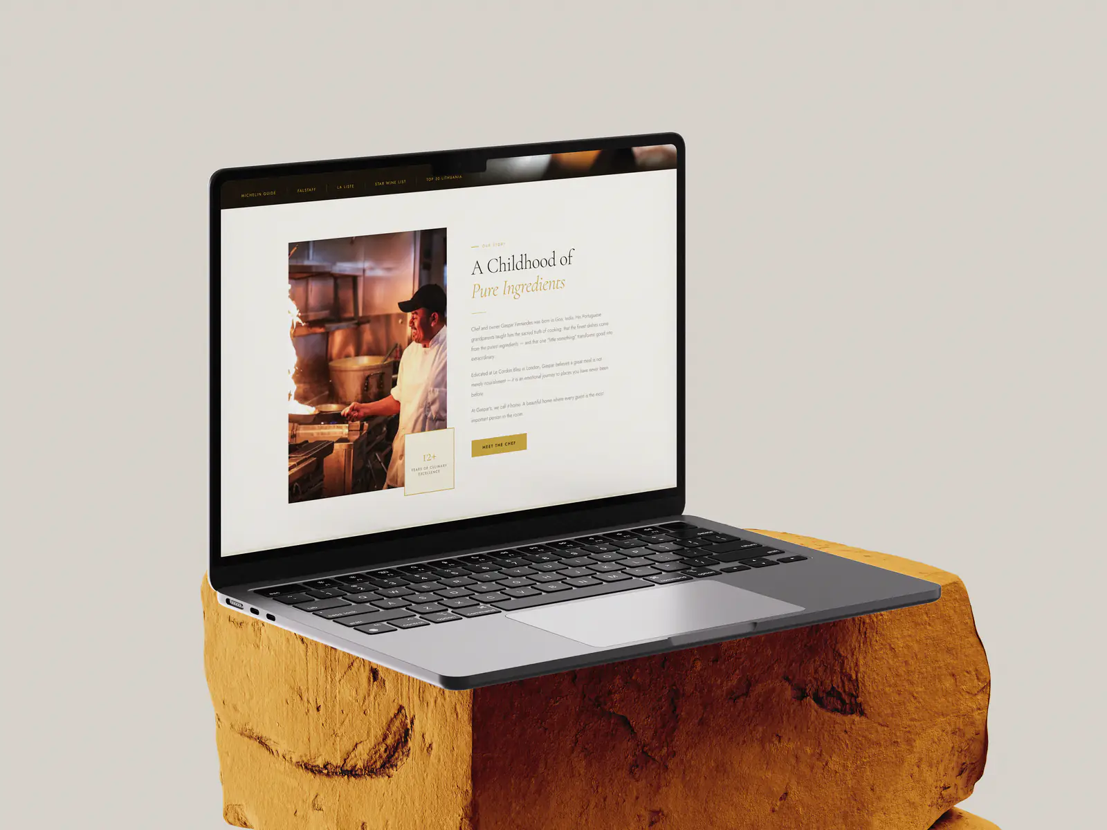
Story page introducing the chef and the kitchen's origins alongside portrait photography.
- 03
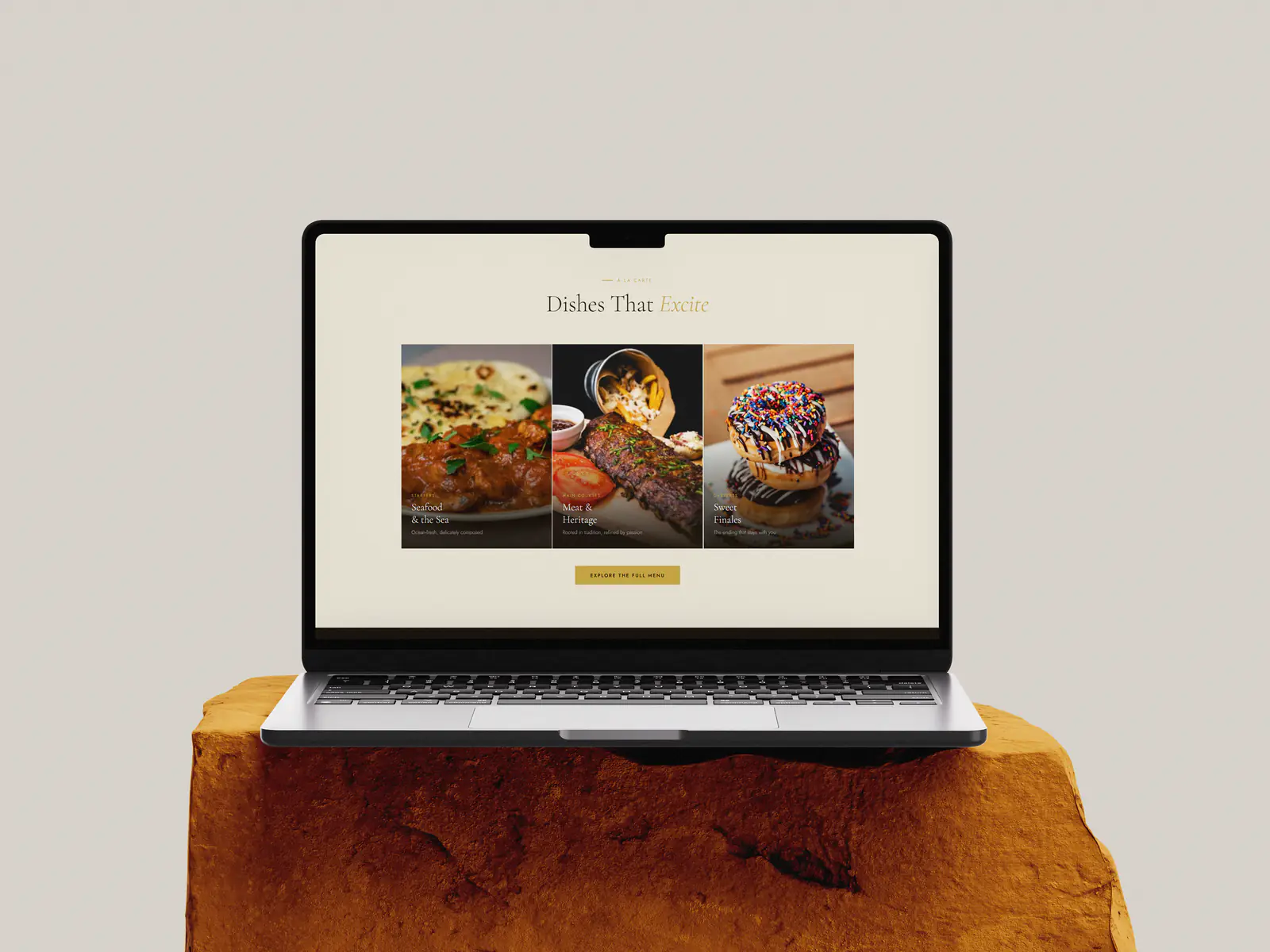
Signature-dishes page laying out plates in a three-column grid with a single call to action.
- 04
Desktop presentation mockups for client review.
Approach
How it was designed
- 01
A sand-and-charcoal palette keeps every accent off the plate, so the food photography supplies all of the colour on the page.
- 02
A high-contrast display serif carries the restaurant name and section headings; an understated sans handles body copy and navigation.
- 03
Generous vertical rhythm and wide margins slow the scroll down, echoing the pace of a tasting menu rather than a takeaway site.
- 04
A single amber button style marks the one action that matters on each screen – reserving a table.