Overview
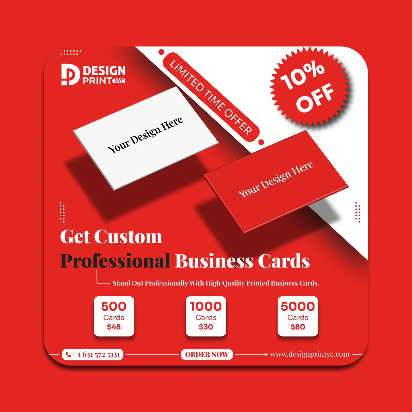
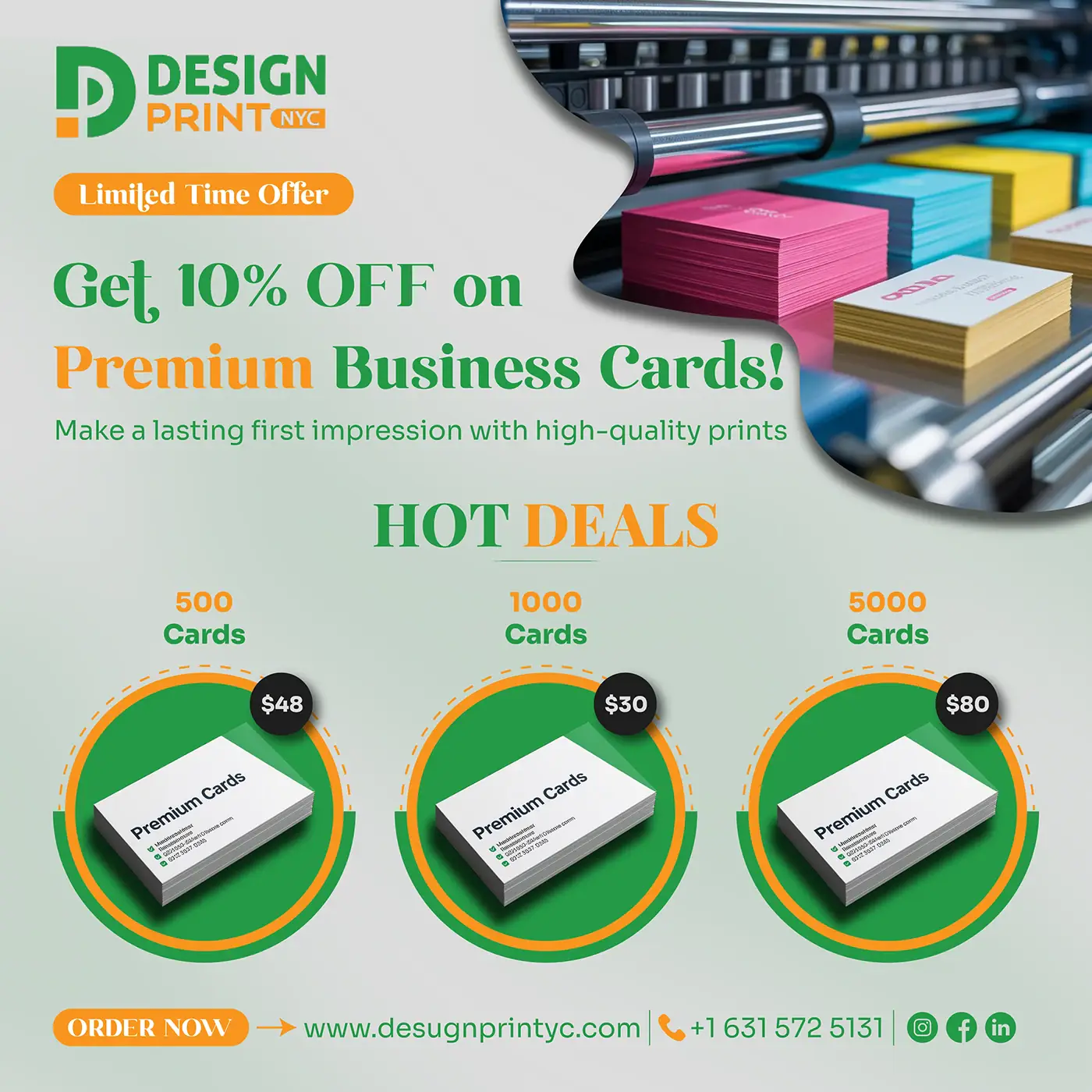
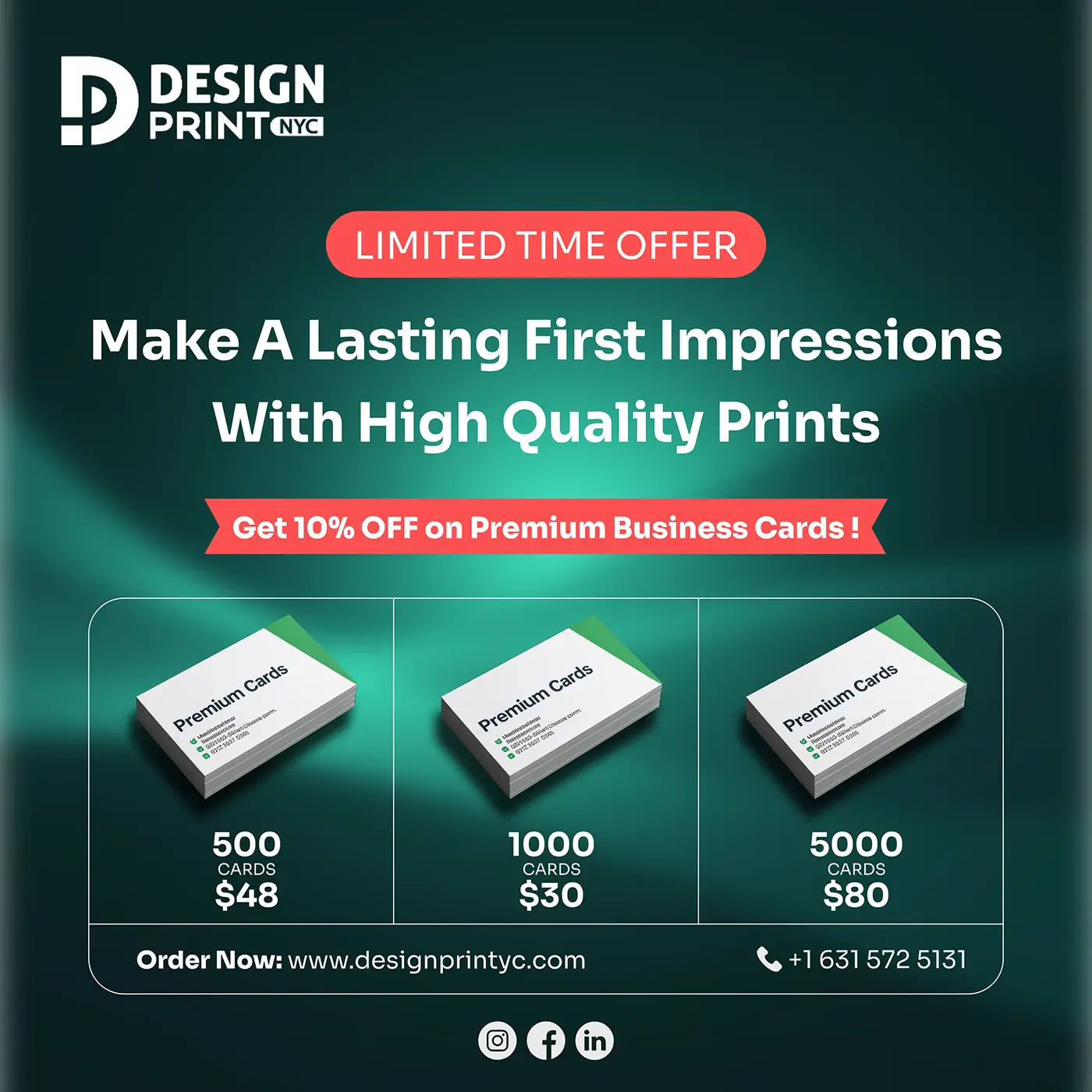
A print shop selling design services has to look good in its own advertising or the pitch collapses. These creatives lead with a hard offer – 500, 1,000 or 5,000 cards at a fixed price – and use the product itself as the imagery.
Deliverables
What was produced
- 01
Three square offer creatives in distinct colourways for rotation.
- 02
A three-tier pricing block reused across all three layouts.
- 03
Limited-time-offer badge, contact footer and social handles bar.
Approach
How it was designed
- 01
Price is treated as the hero, not a footnote – the tier block sits at the optical centre of every layout.
- 02
Each creative runs a different dominant colour so the same offer can be re-posted without looking repeated.
- 03
Product renders are angled and shadowed to sell print as a physical object, which is the shop's actual differentiator.
- 04
The contact row is identical on every post, so a viewer who sees any one of them gets the same route to order.